Unit 05: Introduction to NumPy and Plotting, part II
Contents
Unit 05: Introduction to NumPy and Plotting, part II#

Authors:
Dr Valentina Erastova
Dr Matteo Degiacomi
Hannah Pollak
Email: valentina.erastova@ed.ac.uk
Learning objectives #
plot data using
matplotlibunderstand sources of errors and how to mitigate them
analyse numerical data statistically using in-built functions
quantify uncertainties
Some of the material was adapted from Python4Science.
Table of Contents#
Plotting Data
1.1 A simple plot
1.2 String Formatting
1.3.Object Oriented PlottingErrors: a Discussion
2.1 Sources of Errors and Uncertainties
2.2 Accuracy vs PrecisionIntroduction to Statistics
3.1 Statistical Distributions
3.2 Distribution of Measurements
3.3 Quantifying Uncertainty
Jupyter Cheat Sheet
To run the currently highlighted cell and move focus to the next cell, hold ⇧ Shift and press ⏎ Enter;
To run the currently highlighted cell and keep focus in the same cell, hold ⇧ Ctrl and press ⏎ Enter;
To get help for a specific function, place the cursor within the function’s brackets, hold ⇧ Shift, and press ⇥ Tab;
Links to documentation#
You can find useful information about using numpy and matplotlib at
Import libraries#
import numpy as np
import matplotlib.pyplot as plt
1. Plotting data #
We can use the matplotlib package to plot data using Python.
We first look at the pyplot functional interface, which allows us to manipulate a given current figure. pyplot is great to quickly visualize data we are working with, but it is not suitable for plots of multiple data quantities, subplots, or more complex customizations. In this case, an object-oriented plotting approach is needed. We will discuss the object-oriented plotting in Section 1.3.
1.1 A simple plot #
Example 10#
As always, we begin with importing the matplotlib.pyplot module with the alias plt.
This is the community-agreed alias for matplotlib.pyplot.
# FIXME
Click here to see the solution to Example 10.
import matplotlib.pyplot as plt
Example 11#
To create a plot, we use the matplotlib function plt.plot().
Load in the file data/sub_intensities.txt that you created in Task 2.3 in the notebook of Unit 05, part I.
It is good practice to use plt.show() to show the plot, even though the plot will pop up in Jupyter without this as well.
# FIXME
Click here to see the solution to Example 11.
# Read the file
data = np.loadtxt("data/sub_intensities.txt")

# Plot
plt.plot(data)
plt.show()
Note: the plot displayed is generated from the sub-sampled data, which only has intensities. Therefore, this data does not have the m/z column, so x-axis is just the row number.
Labeling the plot and the data #
It is always good practice to label the plots.
Use the following commands to add the labels to your plot:
xlabel()ylabel()title()
ms.txt data as m/z vs Intensity, label the plot.
# FIXME
Click here to see the solution to Task 1.1.
# Load in the data
data = np.loadtxt("data/ms.txt")

# Assign the columns to 'mz' and 'intensity'
mz = data[:,0]
intensity = data[:,1]

# plot mz against intensity
plt.plot(mz, intensity)

# label the plot
plt.title("Mass spectrometry")
plt.xlabel("m/z")
plt.ylabel("Intensity")

# save the plot
plt.savefig("images/myfigure.png")

# show the plot
plt.show()
1.2 Quick aside on string formatting #
We can use f-strings to format strings in a nice way. This is useful for, e.g., labelling scientific plots.
For example, let’s say we want to creare a plot label for pressure as “Pressure (\(\mathrm{N / m}^2\))” in Python:
    plt.plot(x, y)
    plt.xlabel(f"pressure (N / m$^2$)")
We can do this using LaTex notation given inside the $ $ signs.
Click here for a list of some of the mathematical symbols you can write in this format.
Some of the most useful ones for chemists are superscripts $^{-2}$ and subscripts $_{\mathrm{exp}}$. The expression \mathrm{} stands for “maths roman” which ensures the superscript is written in non-italic.
You can use this “math mode” in markdown cells in a similar way to write equations.
Another useful method of f-strings is formatting the number of significant figures of values. For example, let’s say we want to print the mass of something with 2 significant figures:
    mass = 0.198 # in g
    print(f"The final mass is {mass:.2f} g.")
which prints: The final mass is 0.20 g.
1.3 Object Oriented Plotting #
In Section 1.1, we have done only very basic plots with the pyplot module of the matplotlib package. In this section, we will introduce more complex plotting, by adopting a more sophisticad Object Oriented Plotting approach. If you are eager to know more, please see discussion on PyPlot vs. Object Oriented Interfaces on the matplotlib blog.
Object oriented plotting enables us to get control on all the components of a plot, shown in the figure below.
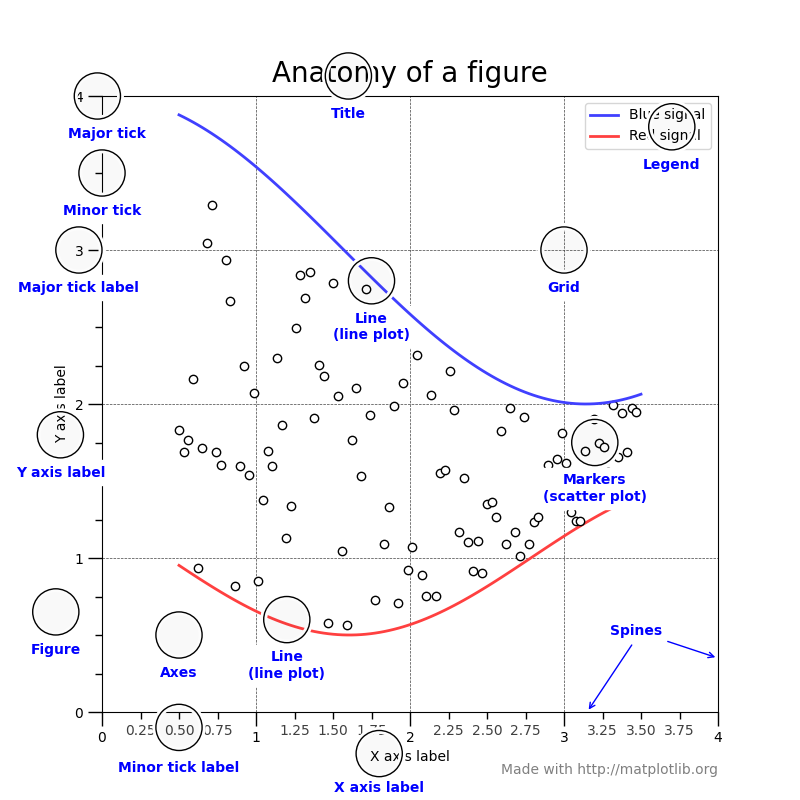
To achieve this, we start with declaring an object which is a container for all elements (shown in blue in the image above) that are rendered onto the object, i.e. our figure.
Declare a figure object:#
The following command produces a single figure (called fig) containing a single axes (i.e. a single plot called ax inside figure)
fig, ax = plt.subplots()
With matplotlib, a figure can be created in different ways:
# an empty figure with no Axes
fig = plt.figure()
# a figure with a single Axes
fig, ax = plt.subplots()
# a figure with a 2x2 grid of Axes
fig, axs = plt.subplots(2, 2)
Add the data onto the axes of the plot with:#
ax.plot(time, distance)
We can also include labels, markers, colors:
# Plot some data on the axes
ax.plot(x, x, label="linear")
# Plot more data on the axes...
ax.plot(x, x**2, label="quadratic", "x")
# ... and some more:
ax.plot(x, x**3, label="cubic", color="orange")
Add other elements, such as labels:#
# Add a y-label to the axes.
ax.set_ylabel("Distance (m)")
# Add an x-label to the axes.
ax.set_xlabel("Time (s)")
# Add a title to the axes.
ax.set_title("My plot")
# Add a legend.
ax.legend()
Adjust figure size and resolution:#
fig.set_size_inches(6,4)
fig.set_dpi(200)
To finish the figure, render it together:#
plt.show()
In Section 3, we will look at an example of how using object oriented plotting to plot a statistical distribution.
ms.txt data using object oriented plotting, modifying the plot;s look to your taste.
2. Errors: a Discussion #
Here are some questions to help you get started:
What kind or errors we often found in scientific experiments?
Are there any less obvious sources that may go unnoticed?
What are the sources of uncertainty?
How can we mitigate the errors?
What about the code we write? Can we make it more reproducible, minimising human error?
What are the differences between random error, systematic error and mistakes?
How does repeating measurements reduce (or not?) the effect on the above errors?
What is the difference between accuracy and precision?
Can you give examples of situations where accuracy is important and where it is not?
Why are repeat measurements important for characterising accuracy. What about precision?
2.1. Sources of Errors and Uncertainties #
Random Error:
Noise in the experimental data
Some scatter of the values
Repeated careful experiments can reduce this error
Statistical tools are for dealing with these errors
Not present in calculations, calculations return same output value (within the precision)
Systematic Error:
Systematically shifted values by a given value/ percentage
Must be handled at the source, for example by recalibration of equipment
May be accounted for during data processing if identified, example: shift all weights by 15 g
Calculations are rarely exact, and so are subject to this error for any approximations that are used
Mistakes:
Mainly human, may be in the equipment or in the code
Must identify, redo/debug
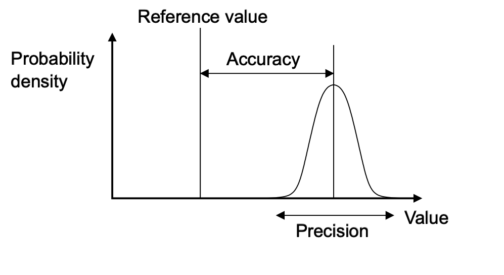
2.2. Accuracy vs Precision #
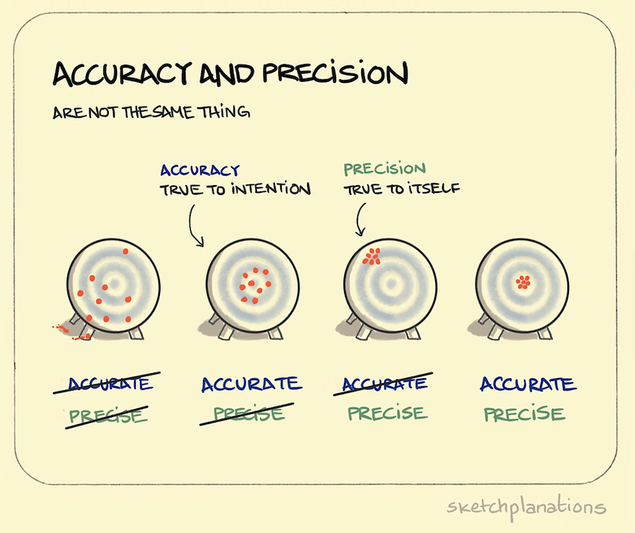
High precision = a low spread of results (low random error)
High accuracy = that the average result is close to “true” answer (low systematic error)
High precision and high accuracy are always desirable, but not always essential.
We can only access accuracy and precision from multiple data points!
3. Introduction to Statistics #
3.1 Statistical Distributions #
Example 12#
A set of 50 samples were weighed in the lab, returning the following results:
|Sample No.| Weight, g ||Sample No.| Weight, g | | —-| —–|| —-| —–| | 1 | 12.7867 || 26 | 13.060 | | 2 | 11.2558 || 27 | 12.67 | | 3 | 11.8226 || 28 | 9.284 | | 4 | 14.2157 || 29 | 11.32 | | 5 | 11.9955 || 30 | 12.57 | | 6 | 12.753 || 31 | 11.909 | | 7 | 10.604 || 32 | 12.055 | | 8 | 12.7267 || 33 | 11.98 | | 9 | 11.3204 || 34 | 11.48 | | 10 | 11.3616 || 35 | 10.99 | | 11 | 12.1384 || 36 | 11.79 | | 12 | 12.301 || 37 | 11.357 | | 13 | 11.032 || 38 | 10.196 | | 14 | 10.8086 || 39 | 12.16 | | 15 | 13.58 || 40 | 11.01 | | 16 | 12.59 || 41 | 12.33 | | 17 | 11.93 || 42 | 12.14 | | 18 | 12.41 || 43 | 11.711 | | 19 | 12.426 || 44 | 12.373 | | 20 | 10.435 || 45 | 13.26 | | 21 | 10.39 || 46 | 11.26 | | 22 | 12.89 || 47 | 12.79 | | 23 | 11.49 || 48 | 12.11 | | 24 | 12.45 || 49 | 11.831 | | 25 | 12.022 || 50 | 10.810 |
The data is stored in a file data/Weights.txt and may have a header! Let’s load this data using numpy (storing it in a variable called data), plot it, and get some statistics!
# FIXME
Click here to see the solution to Example 12.
import numpy as np
import matplotlib.pyplot as plt

# Load data
data = np.loadtxt("data/Weights.txt", comments="#")

# Initialise the figure object
fig, ax = plt.subplots()

# Add data and labels
ax.plot(data[:,0], data[:,1], "X", color="red")
ax.set_xlabel("Sample No.")
ax.set_ylabel("Weight (g)")

# Show plot
plt.show()
3.2 Distribution of Measurements#
Example 13#
If we measure a value many times, we should get a distribution, which can be visualised as a histogram
Here, we look at the histogram for a population of 50 measurements.
We can get a histogram using the np.histogram(a, bins=10) function, where a is a numpy array.
How many bins do you think are needed to display the data we have previously loaded? Try it!
# FIXME
Click here to see the solution to Example 13.
w = data[:, 1]
counts, bins = np.histogram(w, bins=15)
print(counts, bins)
Example 14#
We can now plot it, using ax.stairs(counts, bins):
# FIXME
Click here to see the solution to Example 14
fig, ax = plt.subplots()

ax.stairs(counts, bins)
ax.set_ylabel('Weight, g')
ax.set_xlabel('Count')

plt.plot()
Example 15#
Alternatively, we can use a the function plt.hist(a, bins=10):
# FIXME
Click here to see the solution to Example 15
fig, ax = plt.subplots()

ax.hist(w,bins=15)
ax.set_ylabel('Weight, g')
ax.set_xlabel('Count')
plt.plot()
3.3 Normalising the Data #
In the example above we created a histogram with 10 bins (default).
If we change the bin number, the distribution changes.
If we add more samples, it changes again. It’s difficult to compare two datasets sets of various size.
Therefore, we should express the data as a probability distribution instead of just a sample count.
We can do it by normalising the the data:
where \(x\) is the value of the sample being normalised , while \(x_{\mathrm{max}}\) and \(x_{\mathrm{min}}\) are the maximum and minimum values, respectively.
We can do this in Python by writing a function:
def normalise(data):
    max_value = max(data)
    min_value = min(data)
    for i in range(len(data)):
        data[i] = (data[i] - min_value)/(max_value - min_value)
    return data
# To have the data in percentages, mutliply by 100:
n_ints = normalise(data[:, 1]) * 100
Or, you can also use np.histogram(w, bins=15, density=True) to obtain a probability density, i.e. a normalised histogram.
What does this histogram tell us about the data?
How do random and systematic errors show up in histograms like his one?
This is another way to show the accuracy vs precision we saw on the ‘dart board’ image in Section 2.2:
3.4 Quantifying Uncertainty #
Let’s analyse this data a bit more to quantify the uncertainties.
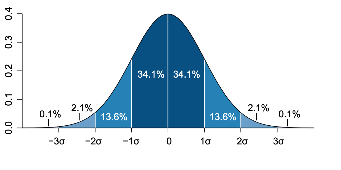
We first represent data as a normal distribution of the population. The normal distribution, or Gaussian distribution, is a distribution centered around the mean value and having a spread of the standard deviation.
The mean, \(\mu\) #
where \(N\) is the number of samples. As the \(N\) increases, the mean becomes closer to the ‘true’ value. This is know as the law of large numbers.
mu = np.sum(a) / len(a)
or, we can just use the NumPy function np.mean(a).
Note: Median is a middle value separating the greater and lesser halves of a data set, since the normal distribution is symmetric, mean and median are equivalent.
The standard deviation (STD), \(\sigma\)#
The STD quantifies how much the numbers in our set deviate from the mean, \(\mu\)
We can write the above as a function in python:
import math as m
sigma = m.sqrt(np.sum((a - np.mean(a))**2) / len(a))
or, we can just use the NumPy function np.std(a).
In a normal distribution the values that are less than 1 \(\sigma\) away from the mean, \(\mu\), will account for the 68.27% of the set - this is our confidence interval
Find the lightest and the heaviest samples, calculate the mean and standard deviation.
Plot the normal distribution for this data:
Create a plot, that will present:
a normalised histogram, shaded with a transparency
a line for mean and median (are they same?)
normalised probability distribution
make sure the plot is labeled
Hint
You can use scipy.stats python package to plot the normal probability distribution of our data.
stats.norm.pdf(a, loc, scale)
where the loc specifies the mean and scale specifies standard deviation.
# FIXME
Click here to see the solution to Advanced Task 3.1
from scipy import stats

# Smallest value and its index
print(f"Lightest sample weight {np.min(w)} g and the sample no. is {np.argmin(w) + 1}")

# Biggest value and its index
print(f"Heaviest sample weight {np.max(w)} g and the sample no. is {np.argmax(w) + 1}")
# Note we add +1 to the output of argmin/argmax, as they begin counting at 0

# Mean and standard deviation
print(f"The mean value is {np.mean(w)}")
print(f"The standard deviation is {np.std(w)}")

# Calculate the probability distribution function (pdf) at each x
pdf = stats.norm.pdf(w, loc=np.mean(w), scale=np.std(w))

# Initialise the figure object
fig, ax = plt.subplots(1, 1)

# Add a normalised histogram
ax.hist(w, density="True", bins = 10, color="lime", alpha=0.2, label="histogram")

# Add mean and a median as a line
ax.axvline(np.mean(w), color="darkorange", label="mean")
ax.axvline(np.median(w), color="magenta", label="median")

# Add a PDF
ax.plot(w, pdf, ".", label="normal distribution")

# Add labels
ax.set_xlabel("Weight (g)")
ax.set_ylabel("Probability, p(w)")

# Add the legend
ax.legend()
plt.show()
Plot a relative likelihood that a particular value of rate constant, \(K\) would be measured, showing the relative probability of each \(K\).
Produce a histogram for the data.
# Here are some rates, K, at a T:
K_250 = np.array([2.567111, 2.562323, 2.61557, 2.4366565, 2.495657, 2.516454, 3.671456])
K_300 = np.array([2.5700804, 2.5660756, 2.6201404, 2.437922,  2.4999964, 2.5190192, 3.6754052])

# FIXME
Click here to see the solution to Task 3.1
# Print the data
print(f"250 K mean = {np.mean(K_250):.3f}, std = {np.std(K_250):.3f}")
print(f"300 K mean = {np.mean(K_300):.3f}, std = {np.std(K_300):.3f}")

# Generate 100 linearly spaced x values
# Start a bit before and finish a bit after the min and max of K_250
start = np.min(K_250) - 0.5
finish = np.max(K_250) + 0.5
x = np.linspace(start, finish, 100)

# Calculate the probability distribution at each x
y = stats.norm.pdf(x, loc=np.mean(K_250), scale=np.std(K_250))

# Plot
plt.plot(x, y, ".")
plt.xlabel("Rate (K)")
plt.ylabel("Population, p(K)")
plt.show()


normal_distribution = stats.norm(loc=np.mean(K_250), scale=np.std(K_250))
values = normal_distribution.rvs(5000)

# Plot a histogram
plt.hist(values, density=True, bins=50, alpha=0.5)

# Use min and max of random numbers to create a range
x = np.linspace(values.min(), values.max(), 100)

# Plot the probability in that range
plt.plot(x, normal_distribution.pdf(x))
plt.xlabel("Rate (K)")
plt.ylabel("Population, p(K)")
plt.show()
Key Points #
matplotliballows you to plot numerical data.Besides line plots,
matplotlibmany more different types of data visualization.Programming a
matplotlibFigure using an object oriented style allows you to control and customise every element in the plot.Most scientific data comes with characteristic uncertainties. Make sure you quantify them, and report them with appropriate Figures.